C# WinUI 3アプリを作っていく途中で、調べたことを忘録的に投稿します。今回はWinUI3プロジェクトで、Xamlに追加したコントロール(今回は[BreadcrumbBar]コントロール)のスタイルを[Lightweight styling]で変更する手順です。
軽量なスタイル設定(Lightweight styling)
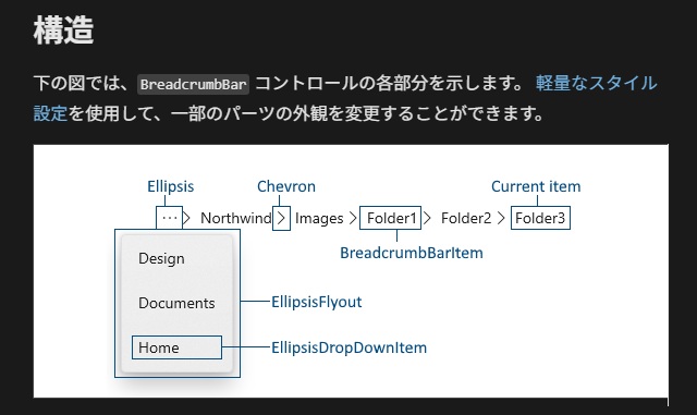
WinUI3プロジェクトに追加できる[BreadcrumbBar]コントロールのドキュメント[階層リンク バー]には次のような記載があります。
[構造]にはコントロール内のパーツ名が記載されて外観を変更可能という記載があります。
[軽量なスタイル設定]リンクに説明が記載されていますが、大雑把で分かり辛かったので備忘録的に、具体的な手順の記録です。
[generic.xaml]を取得
[軽量なスタイル設定(Lightweight styling)]を利用するには、コントロールの既定スタイルを記載したXamlが必要になります。
具体的には、次の手順で取得します。
1.[generic.xaml]が保存されている以下のフォルダーを開きます。
C:\Users\t_nak\.nuget\packages\microsoft.windowsappsdk\1.7.250310001\lib\net6.0-windows10.0.22621.0\Microsoft.WinUI\Themes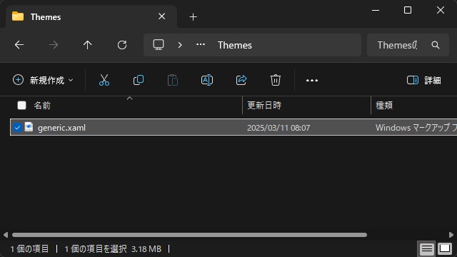
フォルダーの数値部分は、インストールされているWindowsApp SDKによって変わりますが、変更するアプリで実行するバージョンによって読み替えます。
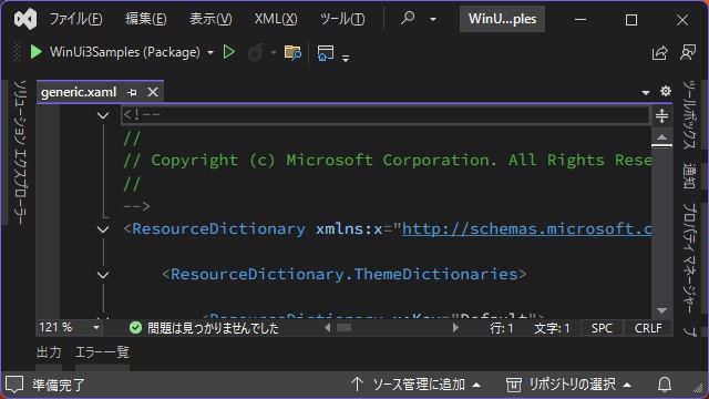
2.[メモ帳]や[Visual Studio]で[generic.xaml]を開きます。
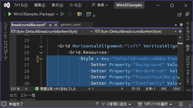
3. キーワード[DefaultBreadcrumbBarItemStyle]でファイル内を検索します。
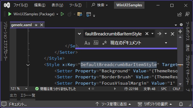
4. 見つかった[Style]タグを選択してコピーします。
<Style x:Key="DefaultBreadcrumbBarItemStyle" TargetType="controls:BreadcrumbBarItem">
  <Setter Property="Background" Value="{ThemeResource BreadcrumbBarBackgroundBrush}" />

...

</Style>
カスタムスタイルを設定
取得した既定スタイルを利用して、コントロールのスタイルを編集していきます。
今回はサンプルとして[Chevron]パーツの表示色を変更します。
具体的には、次の手順で取得します。
1.[generic.xaml]からコピーした[Style]タグをスタイルを適用するXaml内の[Grid]コントロール内にリソースとして貼り付けます。
<Window
  x:Class="WinUi3Samples.BreadcrumbBar"
  xmlns="http://schemas.microsoft.com/winfx/2006/xaml/presentation"
  xmlns:x="http://schemas.microsoft.com/winfx/2006/xaml"
  xmlns:local="using:WinUi3Samples"
  xmlns:d="http://schemas.microsoft.com/expression/blend/2008"
  xmlns:mc="http://schemas.openxmlformats.org/markup-compatibility/2006"
  mc:Ignorable="d"
  Title="BreadcrumbBar">

  <Grid>
    <Grid.Resources>
      <Style x:Key="DefaultBreadcrumbBarItemStyle" TargetType="BreadcrumbBarItem">

...
    </Grid.Resources>
...
  <Grid>
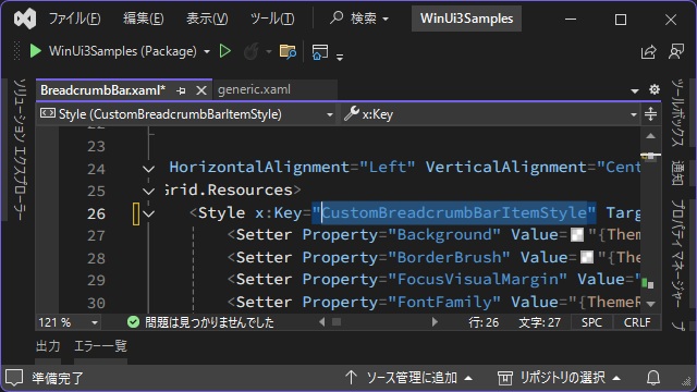
2.[x:Key]プロパティの名前を変更します。
<Window
  x:Class="WinUi3Samples.BreadcrumbBar"
  xmlns="http://schemas.microsoft.com/winfx/2006/xaml/presentation"
  xmlns:x="http://schemas.microsoft.com/winfx/2006/xaml"
  xmlns:local="using:WinUi3Samples"
  xmlns:d="http://schemas.microsoft.com/expression/blend/2008"
  xmlns:mc="http://schemas.openxmlformats.org/markup-compatibility/2006"
  mc:Ignorable="d"
  Title="BreadcrumbBar">

  <Grid>
    <Grid.Resources>
      <Style x:Key="CustomBreadcrumbBarItemStyle" TargetType="BreadcrumbBarItem">

...
    </Grid.Resources>
...
  <Grid>
3.[BreadcrumbBar]コントロール内にリソースに次のコードを追加します。
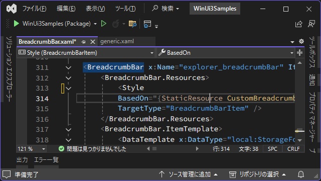
[BasedOn]には前の手順で[x:Key]を変更した名前を設定します。
<BreadcrumbBar x:Name="explorer_breadcrumbBar">
  <BreadcrumbBar.Resources>
    <Style
      BasedOn="{StaticResource CustomBreadcrumbBarItemStyle}"
      TargetType="BreadcrumbBarItem" />
  </BreadcrumbBar.Resources>
  <BreadcrumbBar.ItemTemplate>
    <DataTemplate x:DataType="local:StorageFolder">
      <TextBlock Text="{x:Bind DisplayName}" />
    </DataTemplate>
  </BreadcrumbBar.ItemTemplate>
</BreadcrumbBar>
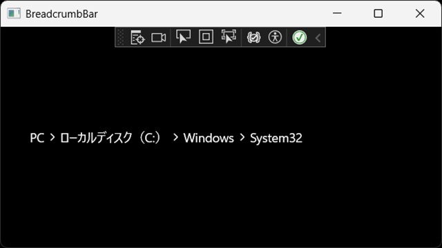
4. 作業を保存して実行します。(スタイルは変更していないので、既定値のスタイルで表示されます)
5.[x:Name:”PART_ChevronTextBlock”]が設定された[TextBlock]コントロールを検索して[Forground]部分を変更します。
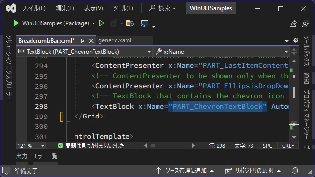
<!-- TextBlock that contains the chevron icon -->
<TextBlock x:Name="PART_ChevronTextBlock"
AutomationProperties.AccessibilityView="Raw"
Grid.Column="1"
HorizontalAlignment="Center"
IsTextScaleFactorEnabled="False"
FontFamily="{ThemeResource SymbolThemeFontFamily}"
FontSize="{ThemeResource BreadcrumbBarChevronFontSize}"
Foreground="{ThemeResource BreadcrumbBarChevronForegroundBrush}"
Text=""
Padding="{ThemeResource BreadcrumbBarChevronPadding}"
VerticalAlignment="Center" />6.[Grid]タグのリソース部分に[StaticResource]を追加します。
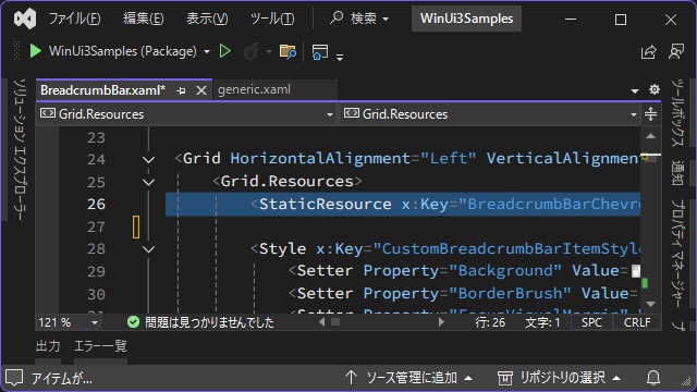
[x:Key]で指定した “BreadcrumbBarChevronForegroundBrush” は、[Chevron]パーツの表示色として利用する変数名です。
<Grid>
  <Grid.Resources>
    <StaticResource x:Key="BreadcrumbBarChevronForegroundBrush" ResourceKey="TextFillColorPrimaryBrush" />

    <Style x:Key="CustomBreadcrumbBarItemStyle" TargetType="BreadcrumbBarItem">
      <Setter Property="Background" Value="{ThemeResource BreadcrumbBarBackgroundBrush}" />
      <Setter Property="BorderBrush" Value="{ThemeResource BreadcrumbBarBorderBrush}" />
7.[BreadcrumbBar]タグのリソース部分に[SolidColorBrush]を追加します。
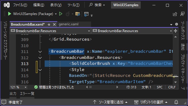
[x:Key]には前の手順で追加した変数 “BreadcrumbBarChevronForegroundBrush” を設定します。
<BreadcrumbBar x:Name="explorer_breadcrumbBar">
  <BreadcrumbBar.Resources>
    <SolidColorBrush x:Key="BreadcrumbBarChevronForegroundBrush" Color="Red" />

      <Style
      BasedOn="{StaticResource CustomBreadcrumbBarItemStyle}"
      TargetType="BreadcrumbBarItem" />
  </BreadcrumbBar.Resources>
  <BreadcrumbBar.ItemTemplate>
    <DataTemplate x:DataType="local:StorageFolder">
      <TextBlock Text="{x:Bind DisplayName}" />
    </DataTemplate>
  </BreadcrumbBar.ItemTemplate>
</BreadcrumbBar>
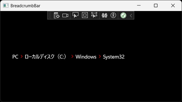
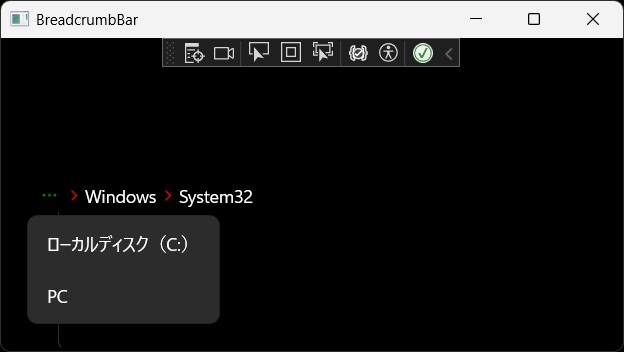
8. 実行すると[Chevron]パーツの表示色が変更されます。
別パーツも変更
同様に[Ellipsis]パーツの表示色を変更します。
具体的には、次の手順で取得します。
1.[Chevron]パーツと同様に[BreadcrumbBarEllipsisForegroundBrush]リソースを追加します。
<Grid>
  <Grid.Resources>
    <StaticResource x:Key="BreadcrumbBarChevronForegroundBrush" ResourceKey="TextFillColorPrimaryBrush" />
    <StaticResource x:Key="BreadcrumbBarEllipsisForegroundBrush" ResourceKey="TextFillColorPrimaryBrush" />
...
2.[x:Name:”PART_EllipsisTextBlock”]が設定された[TextBlock]コントロールを検索して[Forground]プロパティを追加します。
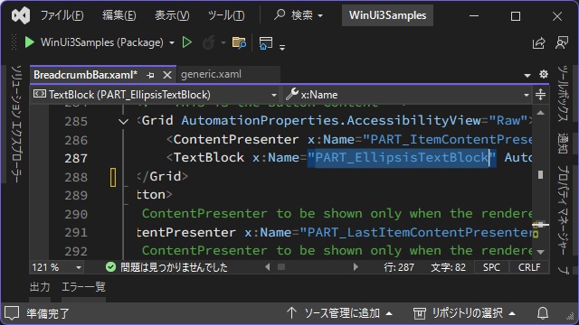
[Ellipsis]パーツの既定値には[Forground]プロパティ設定が無いので、新しく追加します。
<Grid AutomationProperties.AccessibilityView="Raw">
<ContentPresenter x:Name="PART_ItemContentPresenter"
AutomationProperties.AccessibilityView="Raw"
Content="{TemplateBinding Content}"
ContentTransitions="{TemplateBinding ContentTransitions}"
ContentTemplate="{TemplateBinding ContentTemplate}"
FontFamily="{TemplateBinding FontFamily}"
FontSize="{TemplateBinding FontSize}"
FontWeight="{TemplateBinding FontWeight}"
HorizontalContentAlignment="{TemplateBinding HorizontalContentAlignment}"
VerticalContentAlignment="{TemplateBinding VerticalContentAlignment}"
LineHeight="20" />
<TextBlock x:Name="PART_EllipsisTextBlock"
AutomationProperties.AccessibilityView="Raw"
FontFamily="{ThemeResource SymbolThemeFontFamily}"
FontSize="{TemplateBinding FontSize}"
Foreground="{ThemeResource BreadcrumbBarEllipsisForegroundBrush}"
Padding="3"
Text=""
Visibility="Collapsed"
VerticalAlignment="Stretch"
IsTextScaleFactorEnabled="False" />
</Grid>3.[BreadcrumbBar]タグのリソース部分に[SolidColorBrush]を追加します。
[x:Key]には前の手順で追加した変数 “BreadcrumbBarEllipsisForegroundBrush” を設定します。
<BreadcrumbBar x:Name="explorer_breadcrumbBar">
  <BreadcrumbBar.Resources>
    <SolidColorBrush x:Key="BreadcrumbBarChevronForegroundBrush" Color="Red" />
    <SolidColorBrush x:Key="BreadcrumbBarEllipsisForegroundBrush" Color="Green" />

      <Style
      BasedOn="{StaticResource CustomBreadcrumbBarItemStyle}"
      TargetType="BreadcrumbBarItem" />
  </BreadcrumbBar.Resources>
  <BreadcrumbBar.ItemTemplate>
    <DataTemplate x:DataType="local:StorageFolder">
      <TextBlock Text="{x:Bind DisplayName}" />
    </DataTemplate>
  </BreadcrumbBar.ItemTemplate>
</BreadcrumbBar>
4. 実行すると[Ellipsis]パーツの表示色が変更されます。
まとめ
今回は短い記事ですが、Visual StudioのWinUI3プロジェクトで、Xamlに追加したコントロール(今回は[BreadcrumbBar]コントロール)のスタイルを[Lightweight styling]で変更する手順を紹介しました。
マイクロソフトが提供している[階層リンク バー]や[Lightweight styling]では簡単に記載されているので全体像が把握し辛いです。
各コントロールに関するスタイルの簡易的に変更する[軽量なスタイル設定(Lightweight styling)]は、既定値が保存されている[generic.xaml]から目的のコントロールのスタイル既定値をコピーして、アプリ内のXamlで編集を行い適用する方法でした。
WinUI 3アプリで画面に設置したコントロールの表示色は形状を簡易的に変更したい人の参考になれば幸いです。
スポンサーリンク
最後までご覧いただき、ありがとうございます。